01 Network home
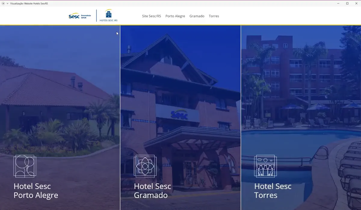
Choose one of three hotels — Gramado · Porto Alegre · Torres

Redesigning a hospitality platform for a public institution — across three hotels, three cities, and one unexpected constraint.
Promote socio-educational actions that contribute to the social well-being and quality of life of workers in the goods, services and tourism sectors, their families and the community — for a fair and democratic society.
Sesc/RS is a public institution in southern Brazil that promotes social well-being through culture, sports, and tourism. Their hotel network — three properties in Gramado, Torres, and Porto Alegre — had no unified digital presence: each hotel relied on an outdated, difficult-to-use website with no responsive design and a cumbersome reservation process.
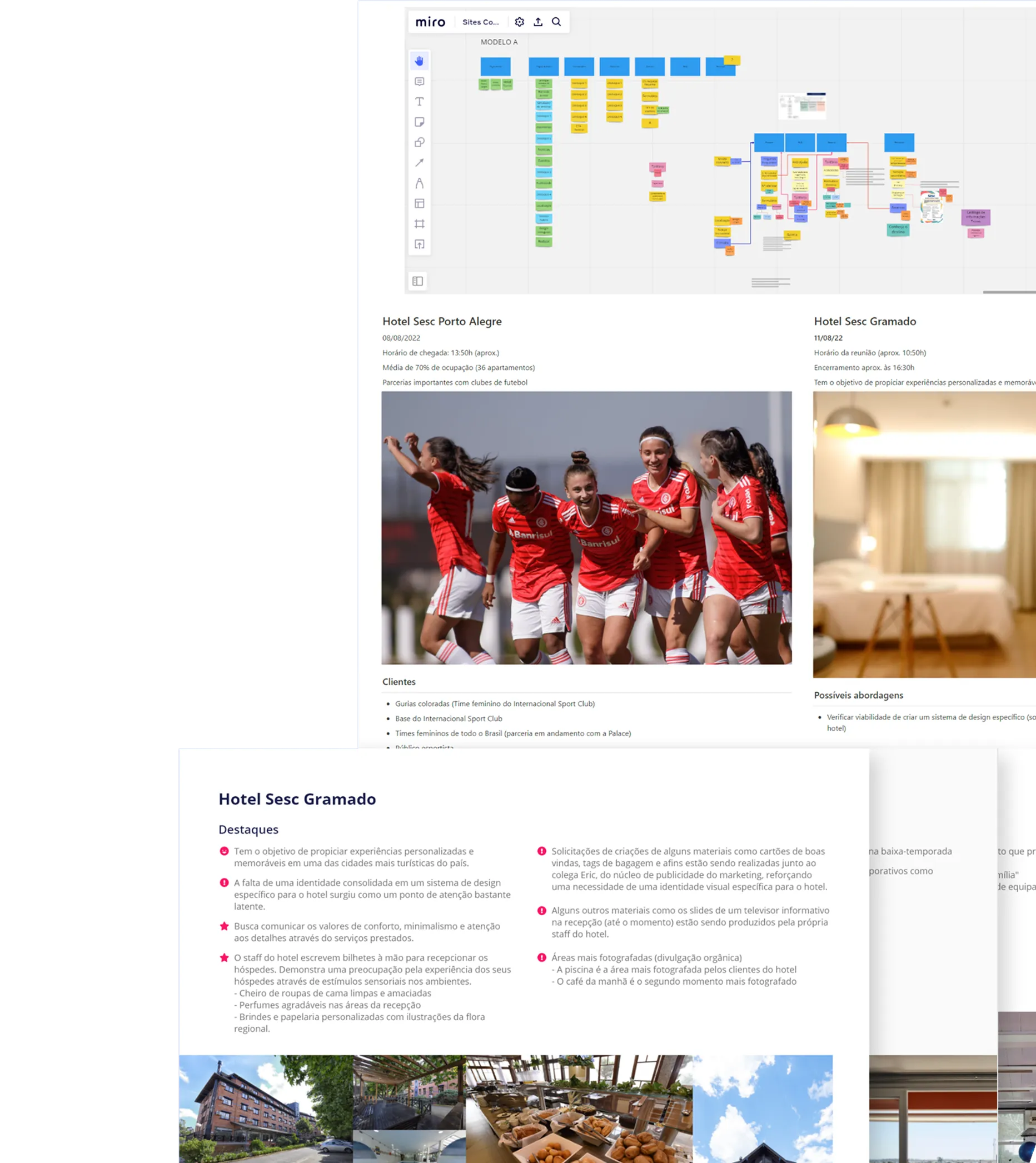
The most valuable phase was on-site technical visits to each hotel. Rather than designing from assumptions, I interviewed hotel staff — from front desk to management — to understand not just guest needs, but the internal operations a new digital product would need to support.
Mid-project, the integration with a third-party reservation engine fell through. The transactional core of the product — the feature users would come to the site to use — was no longer available for launch.
Rather than shipping a broken promise or delaying indefinitely, I took this back to the research. Drawing on what I'd learned from hotel staff during discovery, I proposed an alternative: a structured pre-reservation flow that presented accommodations clearly and streamlined the submission of interest forms to hotel staff — who would then follow up directly.
From first visit to confirmed stay — mapped from the live product.
Choose one of three hotels — Gramado · Porto Alegre · Torres
Each with its own identity on a shared foundation
Stay dates + guests: adults, children, pets
Options and rates for the chosen period
A simple interest form — no payment step
Sent directly to the reservations staff
Staff contact the guest directly — the hotels' service advantage
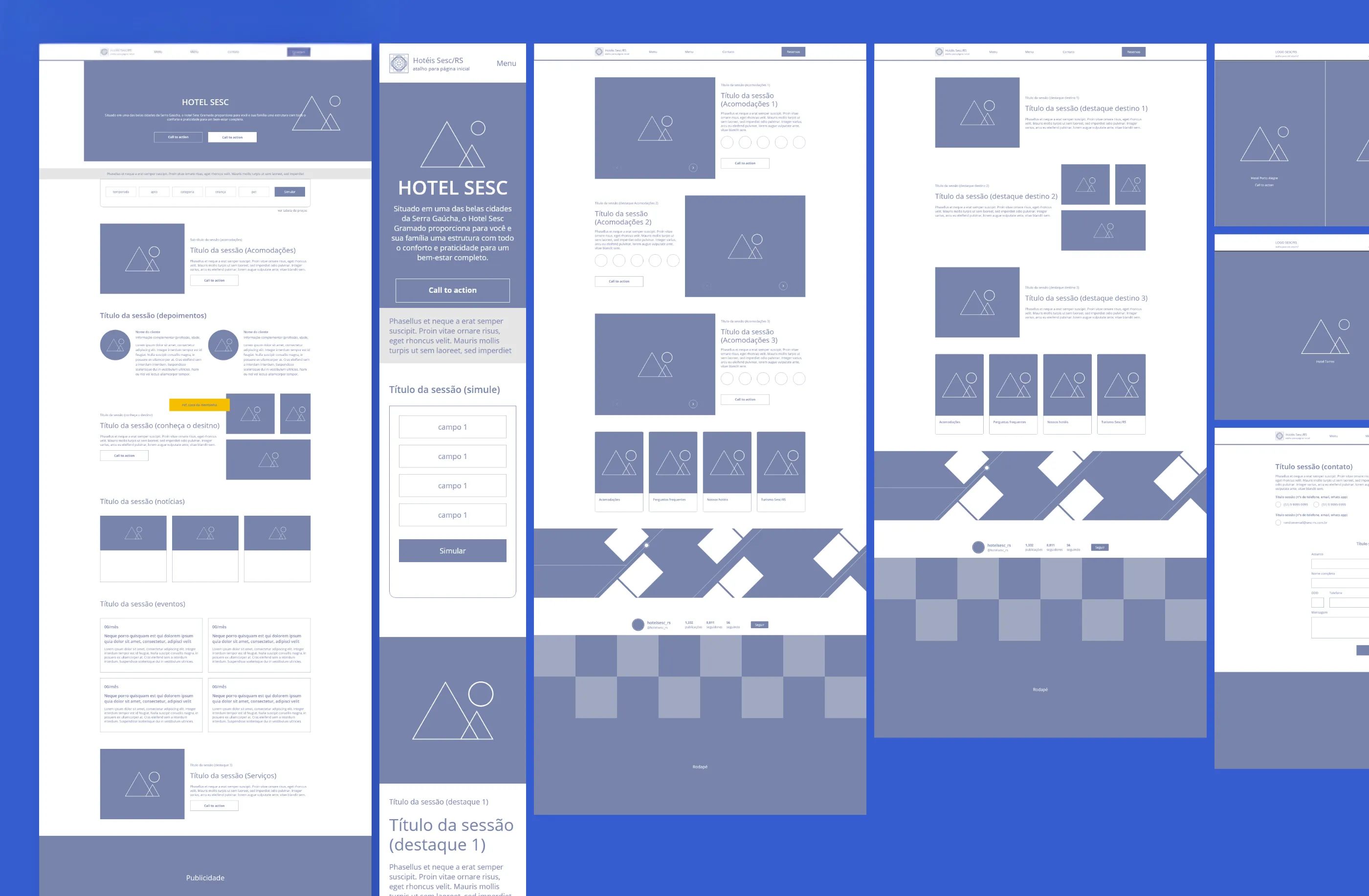
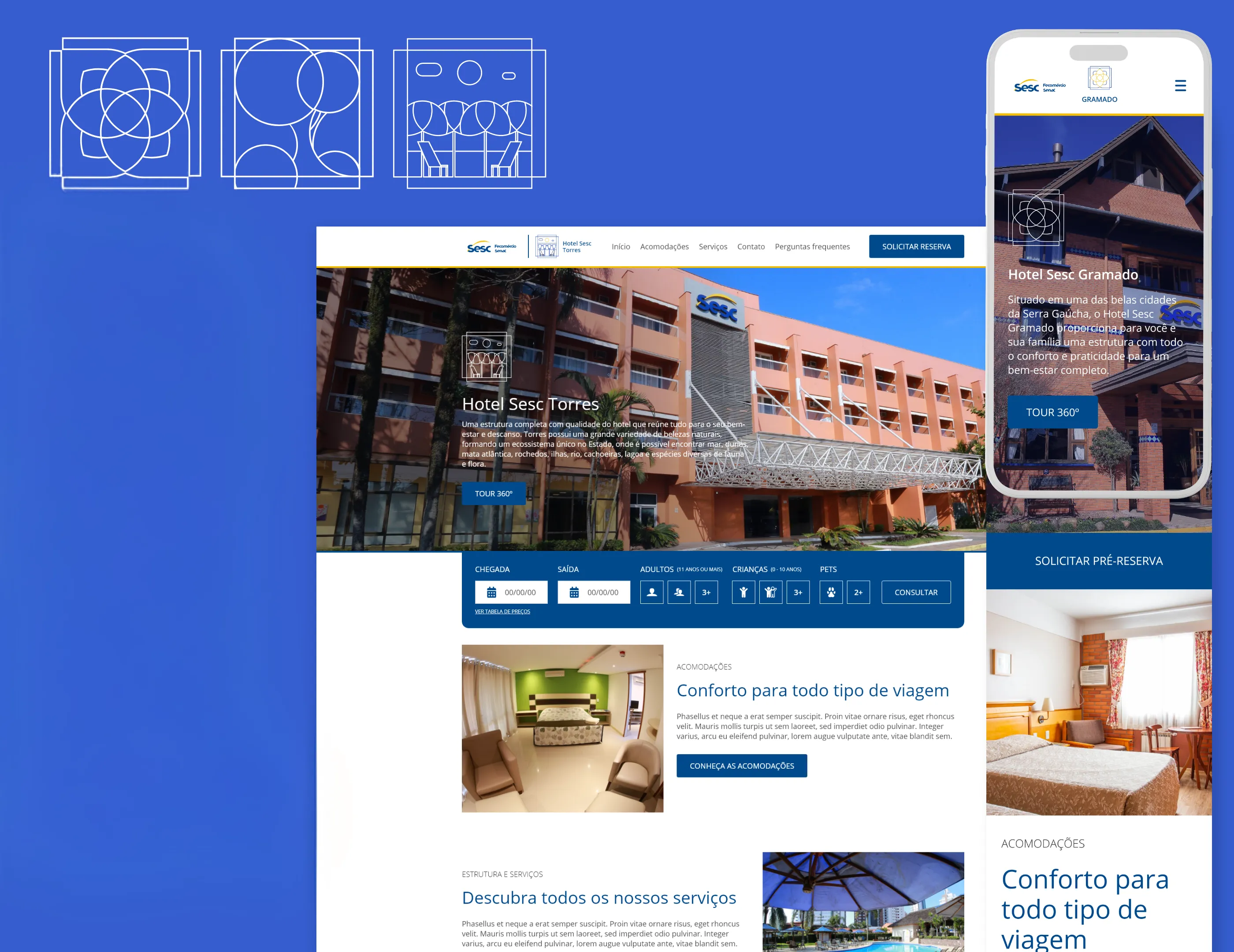
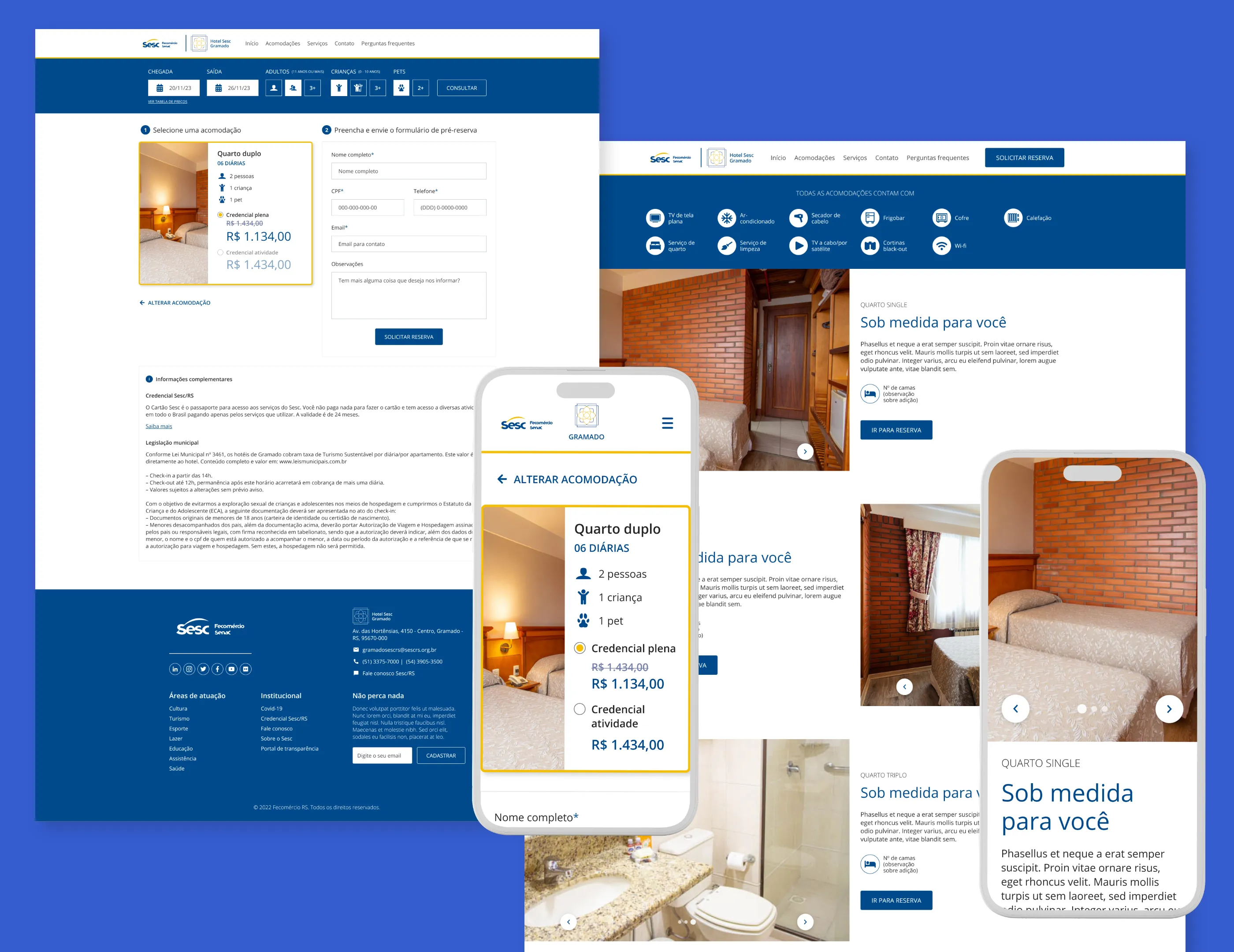
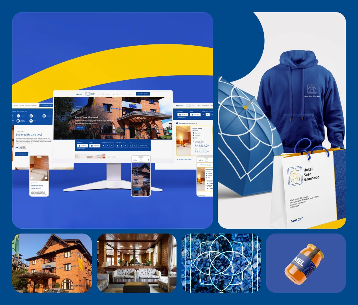
The final product included responsive websites for all three hotels — desktop and mobile — with a clear information architecture, a pre-reservation flow that reduced friction without requiring a booking engine, and three distinct visual identities built on a shared component foundation.
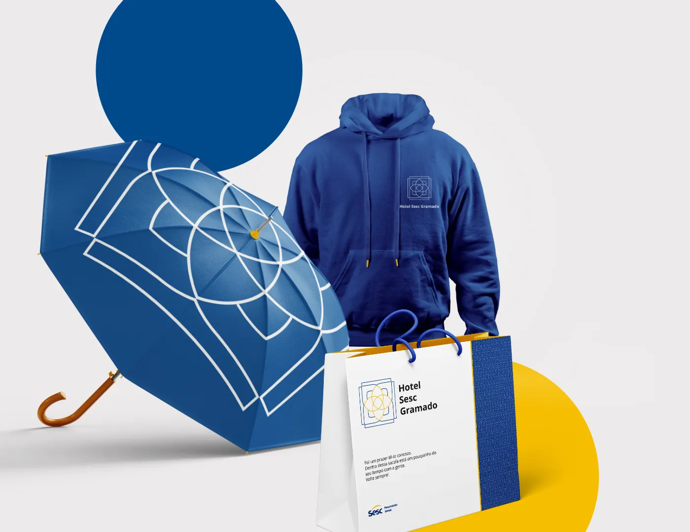
Research also made it clear that although the three hotels belong to the same company, each offers a different experience tailored to a distinct public. The managers all expressed the same need: each hotel had to look and feel like itself.
From those conversations I proposed creating brands that could live inside the larger Sesc-RS design system and visual identity.
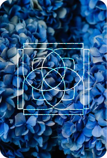
The hortensias that blanket Gramado every summer — their clustered, rounded petals forming soft geometric bouquets — became the central motif for the hotel's logo. I abstracted the flower's radial symmetry into overlapping rounded shapes, capturing the organic warmth and lush character of the region while keeping the mark clean enough to work across the Sesc-RS identity system.
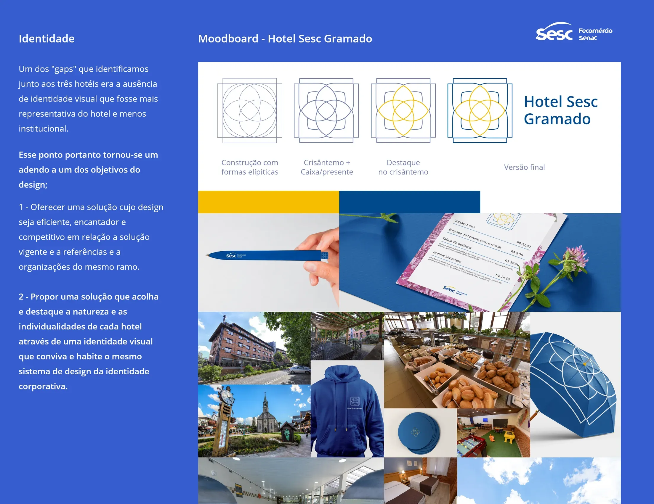
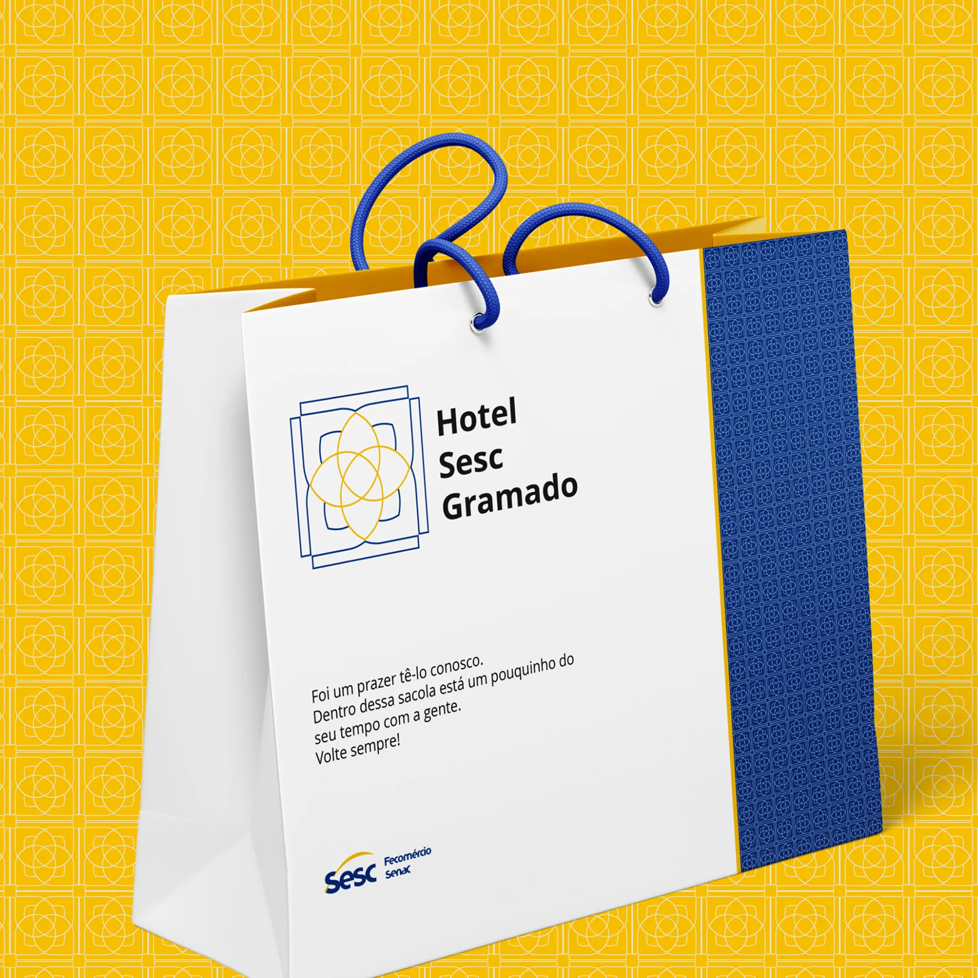
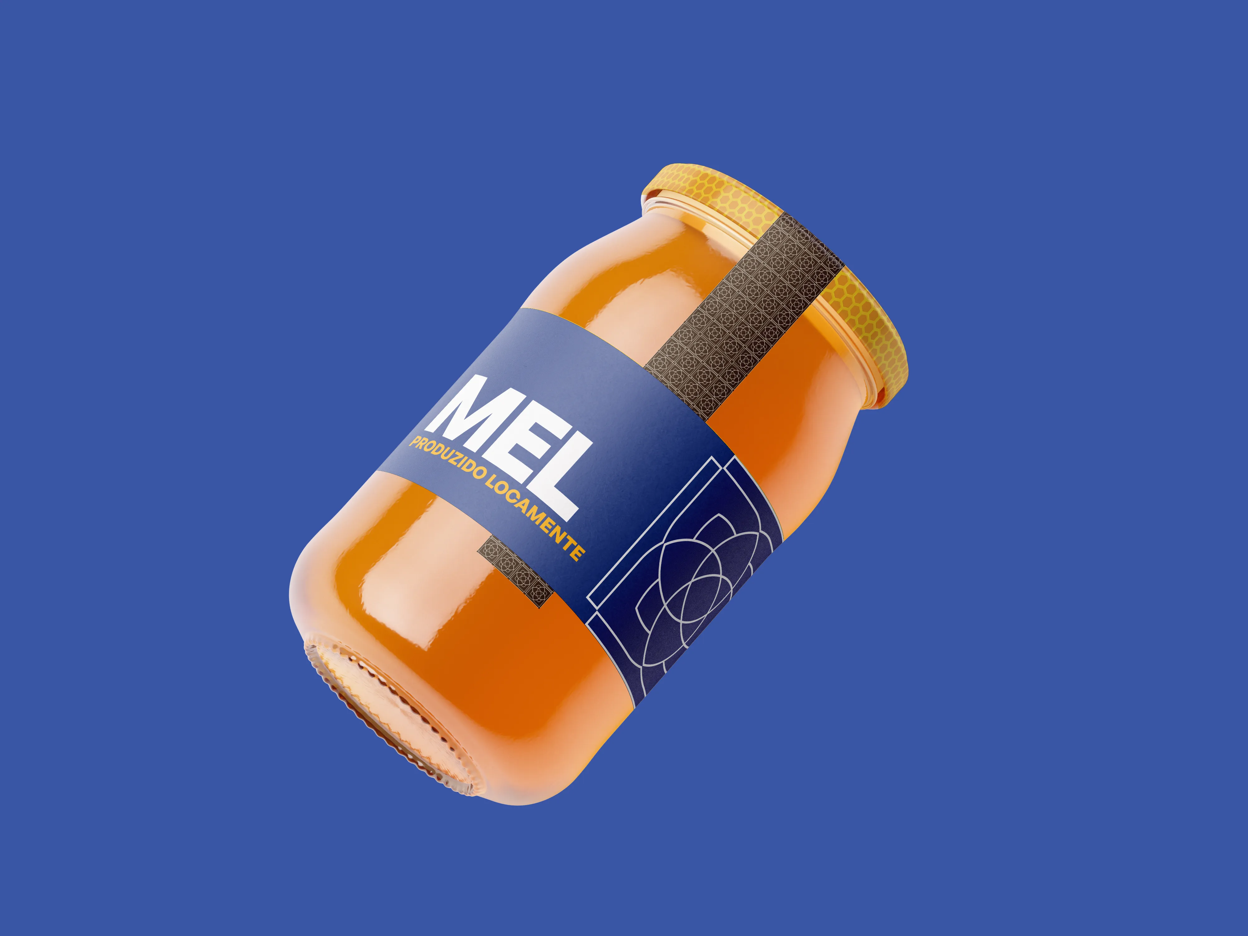
Research also made it clear that although the three hotels belong to the same company, each offers a different experience tailored to a distinct public. The managers all expressed the same need: each hotel had to look and feel like itself.
From those conversations I proposed creating brands that could live inside the larger Sesc-RS design system and visual identity.
A single, governed design language unifying four institutions and serving roughly 2M people across web, app, and internal systems.
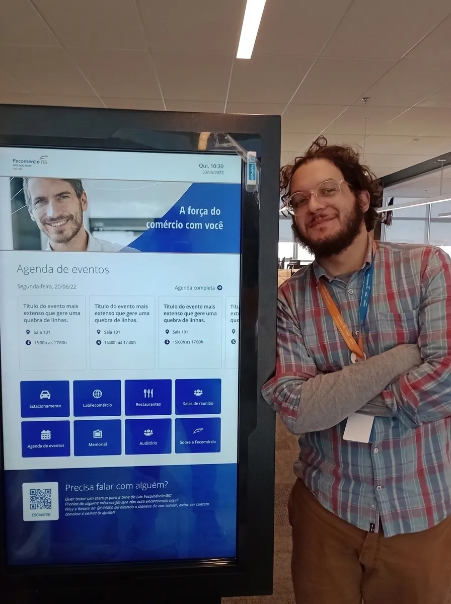
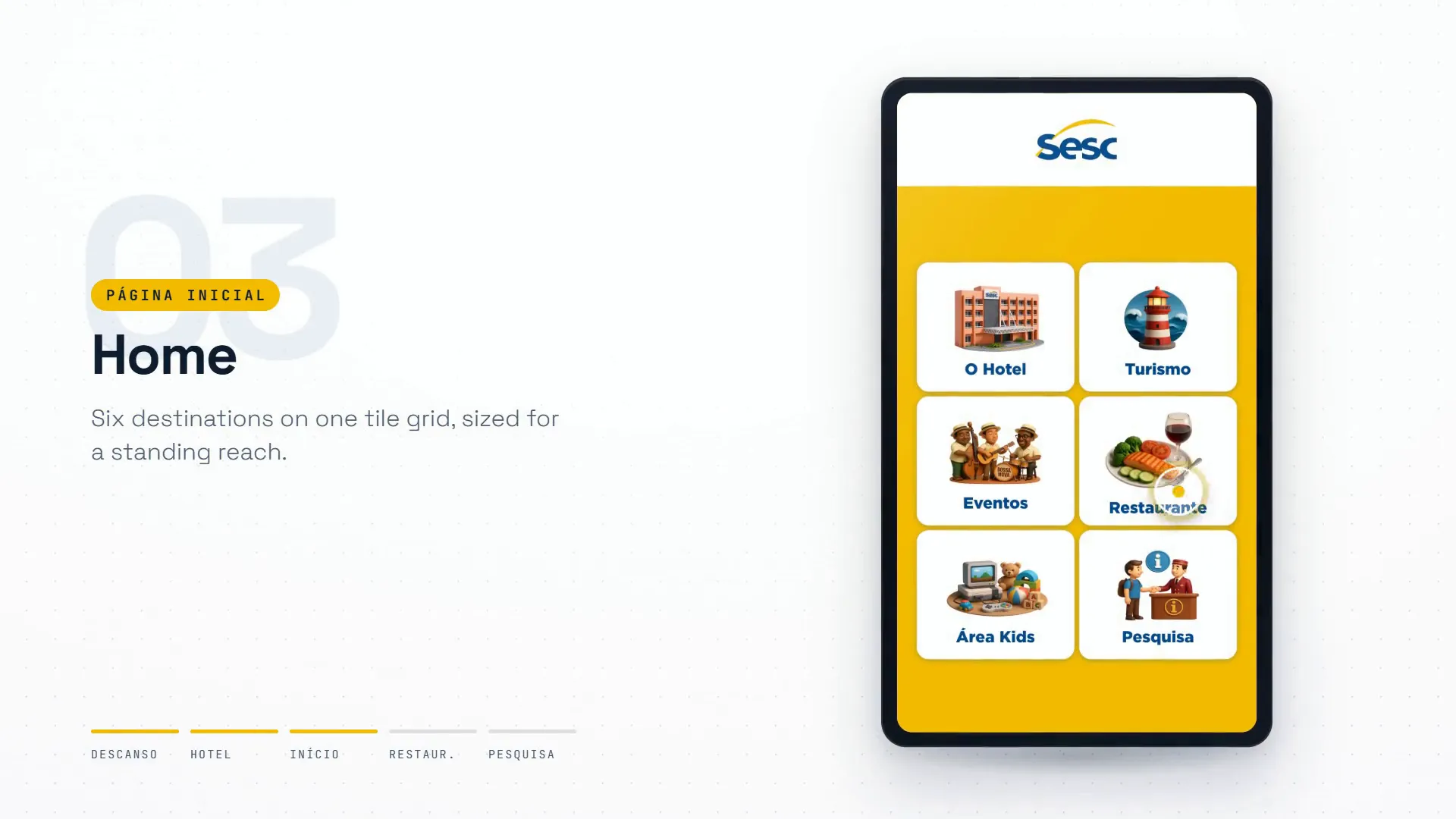
A lobby totem that greets visitors to the headquarters — breakfast, meeting rooms, parking, and a QR tap straight to reception on WhatsApp